Interactive Climate Map Shows Past, Future
March 21, 2018
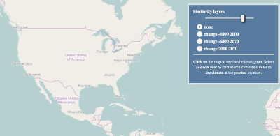
A geography professor's new project can facilitate current climate comparisons and future climate predictions. Tomasz Stepinski, of the University of Cincinnati, unveiled an interactive map that incorporates 50 years of meteorological data compiled from 50,000 weather stations around the world. Students or other researchers can compare their own area to others in the world having a similar climate. The map, called ClimateEx, includes data for both temperature and precipitation, something that Stepinski said wasn't always found in climate models. The map also looks to the future, using prediction models to show graphically where in the world will experience higher or lower levels of climate change in the next 50 years. The map is color-coded. Green areas are predicted to have the least climate change. Yellow areas are predicted to have slightly more. The scale moves to higher levels of expected climate change with colors running to white and then, ultimately, brown. Polish researcher Pawel Netzel worked with Stepinski in the latter's lab at the University of Cincinnati. Their article about their map is in the March edition of the Bulletin of the American Meteorological Society. The last map project of longtime professor Stepinski examined racial diversity in neighborhoods across America. |
Social Studies for Kids |


Social Studies for Kids
copyright 2002–2019
David White